
Elevating Limble
I led the redesign of Limble CMMS, a maintenance management web and mobile app. As a result, we achieved a 37% reduction in deals lost and a customer satisfaction score of 95%.
Role
Solo Product Designer
Tool
Adobe XD, Illustrator, Photoshop, Figma, Zoom, ProductBoard
Duration
9 months
Background
Thousands of users have embraced Limble as their best friend when it comes to filling out work orders, completing them, and tracking their progress and financial savings. However, growing at such a rapid pace presented some issues. Upon internal examination, we found:
We lost many deals because of the application’s outdated interface and unaddressed usability issues.
Addressing deals lost
Deals Lost Trends Research
Research exposed many deals were lost due to the outdated interface.


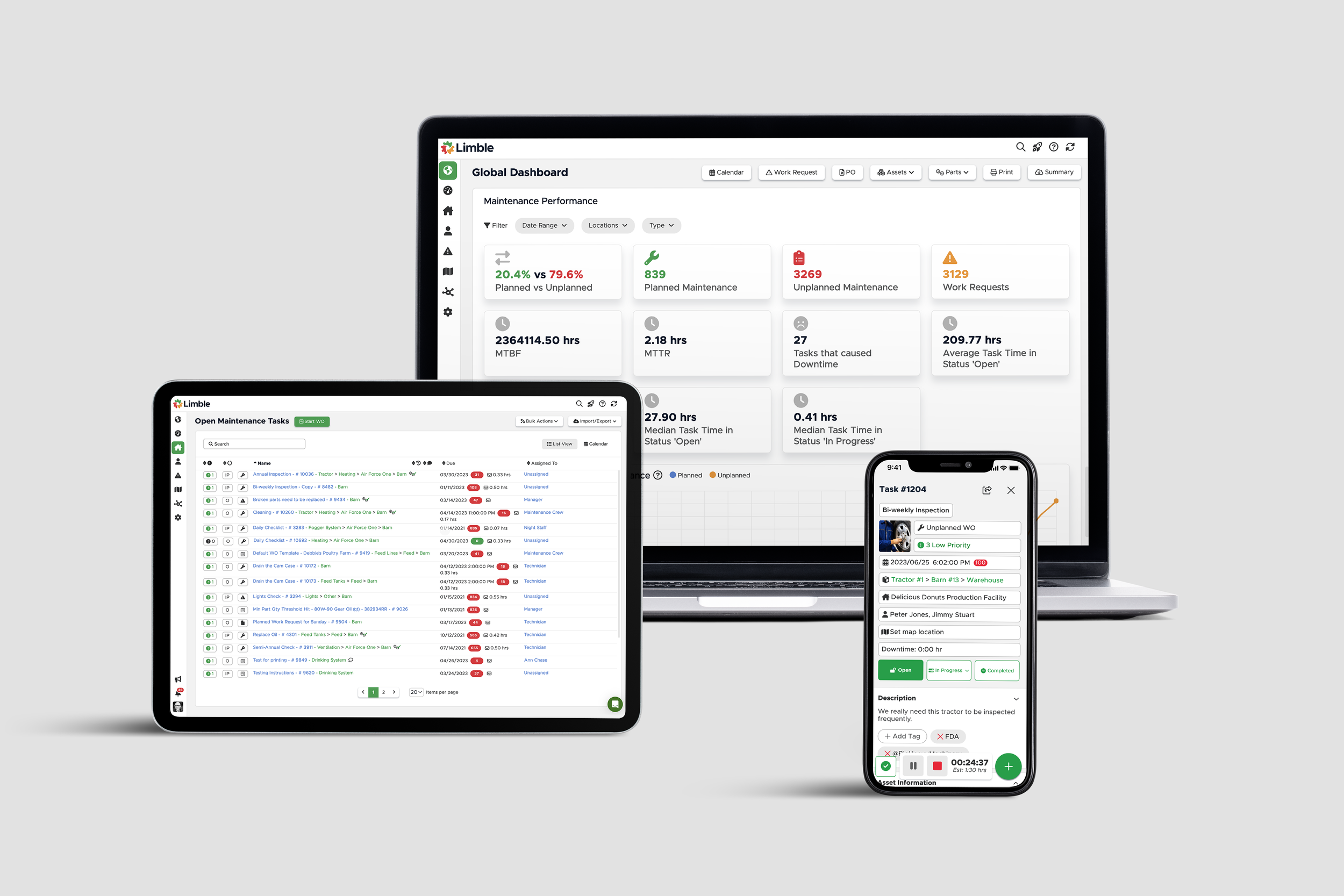
2022 UI


The task was straightforward: make Limble visually appealing and even easier to use.
This entails two key aspects:
Ensure consistency across all screens and pages
Refine the user experience (UX).
I began a competitive analysis to understand the common design patterns familiar to our users. Throughout the process, we kept in mind that our users prefer a straightforward experience over flashy aesthetics.


Three key takeaways
The simple interface minimizes cognitive load.
The sidebar navigation allows for quick access.
The font and color need to adhere to the WCAG guidelines for accessibility.
Where should we improve?
I conducted interviews with our users throughout the entire process. These interviews were mainly conducted through Zoom and were recorded so that we could go back and take notes on everything that was said.
Afterward, we input the feedback and comments into ProductBoard to document them. The feedback provided us with many good options for further refining the product. We incorporated as many as possible into the final product, including:
Making the table more compact to show a longer list of items on the screen.
Improving the global search capabilities.
Providing the option to hide or show all instructions.
Feedback Session on Zoom


Documenting feedback in ProductBoard


Coming up with solutions
Since the global dashboard is the first thing users encounter when they land on the page, we needed to establish a consistent design language for it, which would then carry over to other screens.
The issue with the old UI was the abundance of elements and colors that overwhelm users. We must eliminate distractions and show only the most important elements.
I also addressed the most important navigation issue in the current product: the left navigation bar is hard to use. If a user has multiple locations on the left sidenav, they won't be able to see other buttons clearly. I determined that moving the location navigation to a separate area will allow users to see all locations and actions at once.
When a user has a lot of tasks, all important buttons (add new tasks or pagination) are hidden when scrolling down the page. I decided that having a sticky area for these buttons is key to improve the user experience. The main content section is also static and the users can only scroll in-line.


Old Dashboard UI

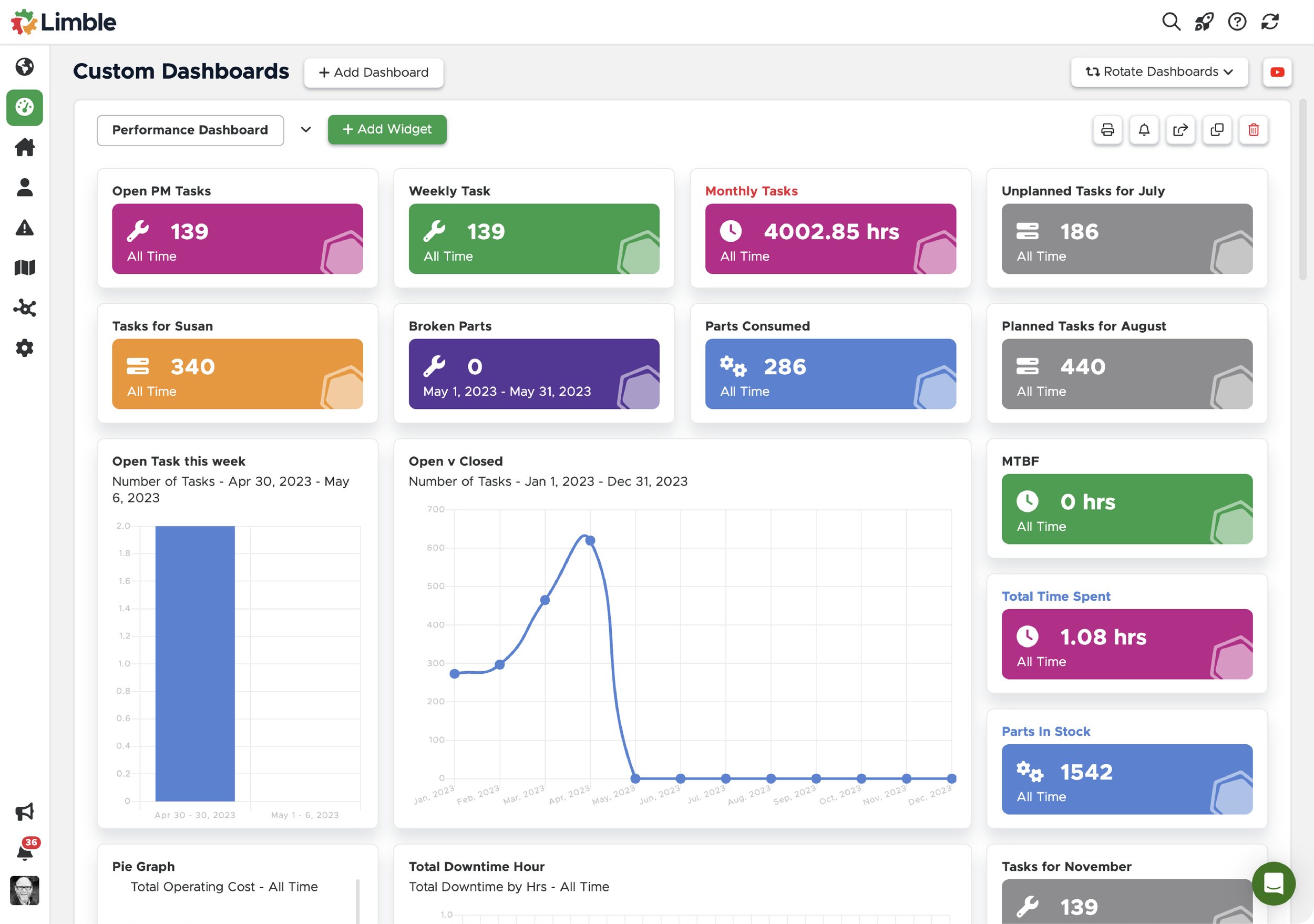
Global Dashboard Variations


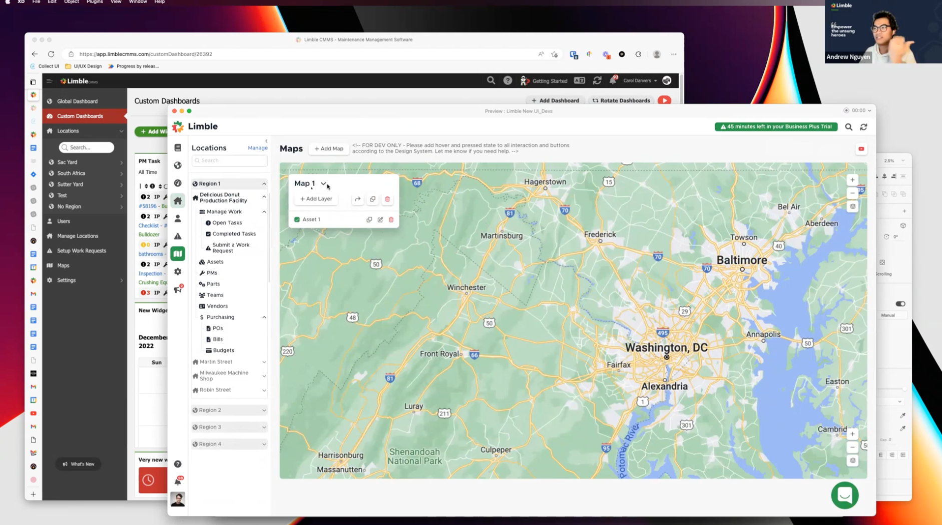
Design System
We continued to work and explore these ideas until we achieved the ideal version: one that was spacious enough to clearly display important information yet dense enough to fit on smaller, older monitors. (We learned through user testing and interviews that maintenance departments often used older equipment, such as small monitors or mice without a middle scroll button.)
As we further solidified our font choices, icon library preferences, and more, a design system began to take shape.
About three months into the project, I created enough pages and screens (approximately 250 screens) to understand how our design system would look. Below are some pages from our current design system.


The results…
Deals lost because of the UI reduced by 37% .
Customer satisfaction's score rose to 95% after addressing bugs in the new system.

2023 UI


speed up design implementation by 10x!
The feedback in the first month of the new UI release indicated that weren’t enough contrast between elements. People encountered numerous readability issues that prevented them from working efficiently. We conducted multiple interviews with those users and customer support team to clearly understand the problem.
As a result, we increased the contrast of the whole app by darken the light grey colors and the text overall. We also introduced dark mode as another option that enhances the contrast between elements. Dark mode was implemented in just 3 days, 10x faster than before because of the newly implemented design system and design tokens. This implementation received a 96% satisfaction rate in a poll.

