Church’s Chicken Redesign

Role/
Designer
Tool /
Procreate (idea sketching), Adobe Illustrator, Adobe Photoshop
Challenge /
Everyone loves good food. But not everyone is willing to endure an “unkind” attitude to get them. My friends and I share the same opinion that Church’s Chicken’s customer service can always use a slight improvement. Because of that, their brand image suffers, and they might lose customers to KFC or Popeyes.
Solution /
I came up with a redesign that shows a more modern and friendly vibe to this beloved brand.
Church’s Chicken has had the same look since the 1990s with the name inside a circle. I wanted to open up the logo and focus only on the essential elements. Their latest logo revision seemed too serious, in my opinion, because of the color combination. I wanted the colors to be bright and friendly, so I brought back the blue and orange of the 2000s logo but more brilliant in value and with more saturation. I also introduced a fun font to make the brand more modern and inviting.


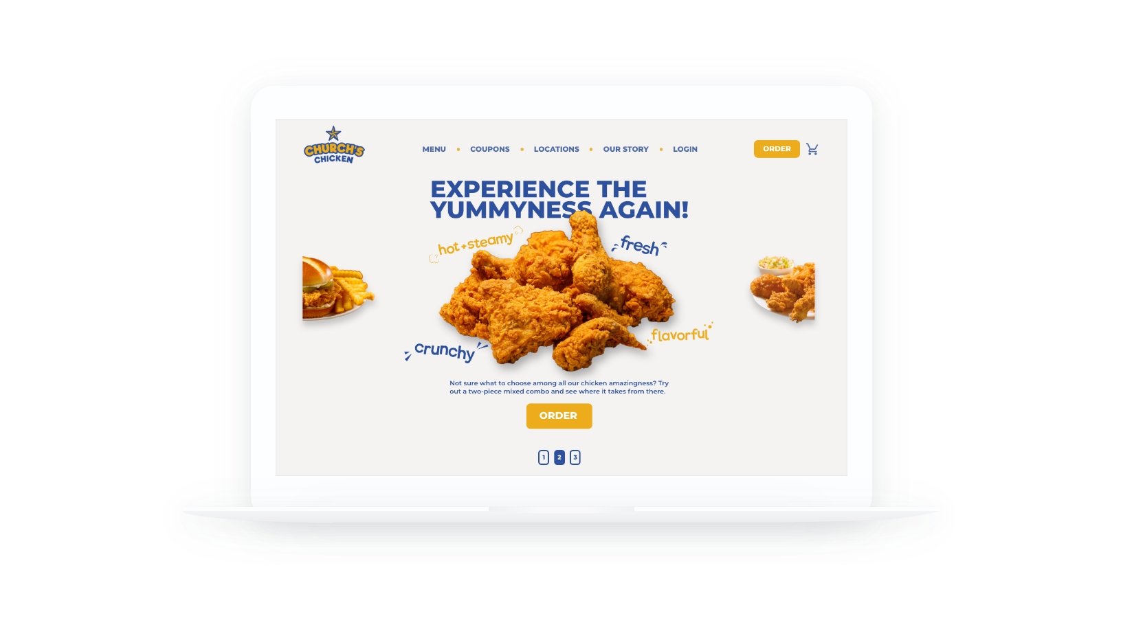
Website Design /
I also reimagined the user interface of the Church’s Chicken website by placing a lot of focus on showing the texture of the fried chicken. The tagline “Experience the yumminess again!” is a call to action to invite the customers to come back and give us a second try. I highlighted the “Order” button by using orange so no one would miss it. The button was placed right underneath the image to help the customers purchase the food right away.