FSTOPS Magazine

Role/
Designer
Tool/
Adobe Illustrator, Adobe Photoshop, Adobe InDesign
Product/
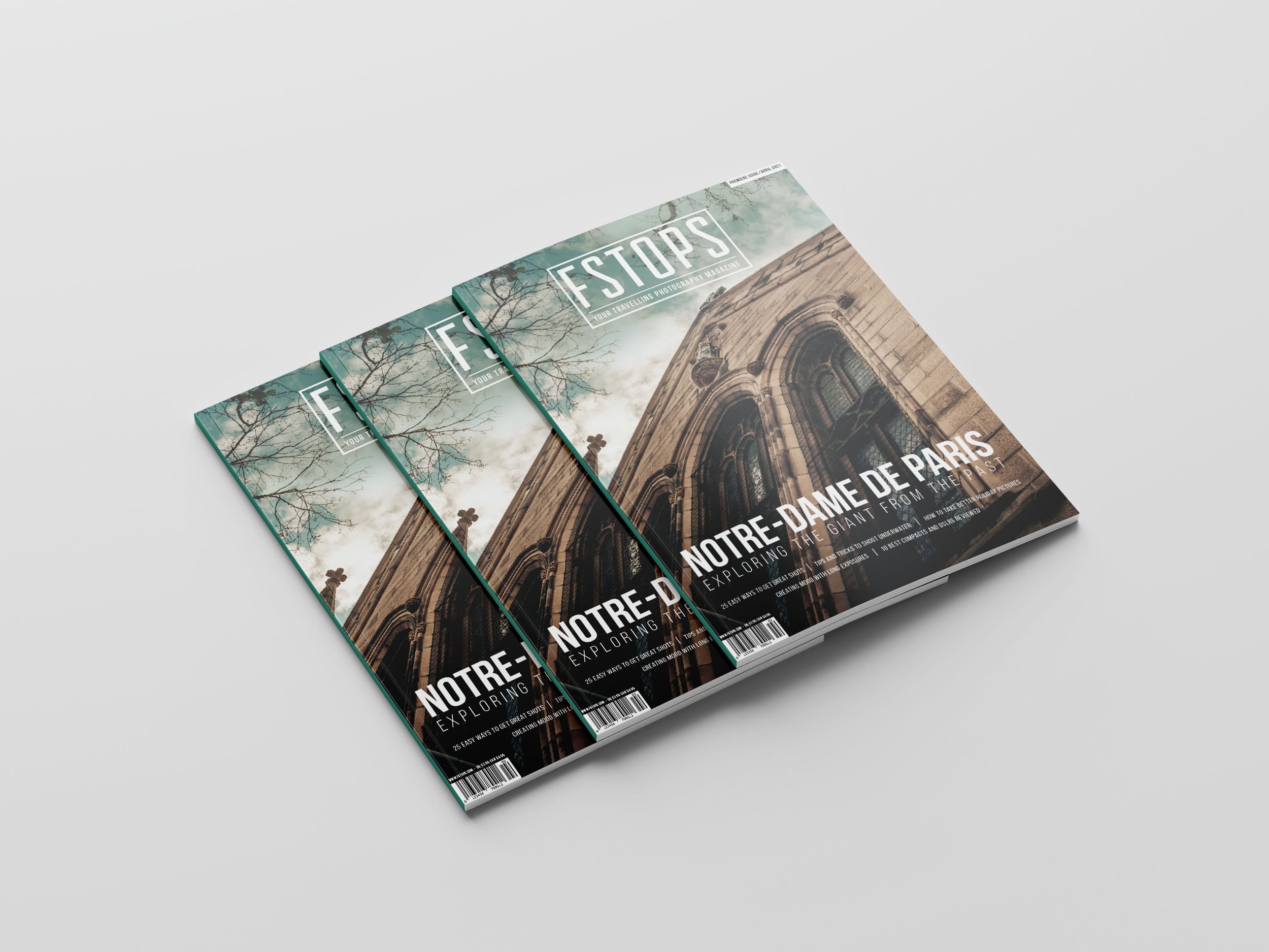
FSTOPS Magazine is a travel photography magazine. Their focus is to introduce unique places to people interested in photography and traveling. The cover always features breathtaking locations in a nicely composed photograph.
Design Process/
Logo - I design the logo to be simple and easy to read because it needs to be recognized at a distance on the magazine rack.
Cover Photo and Elements - The cover photo and the main article's title are in a prominent position to showcase the featured article of this month's issue, which is the Notre Dame. Below are some other miscellaneous articles that might also pique the readers' interest. The barcode is strategically placed in the left corner to balance out the issue month on the top right corner.
Table of Contents - I want the table of contents to look nice but not busy. There are lots of information to display, so it is challenging to fit everything on the pages without making it look messy or cluttered. I decide to add photographs to the most important articles and compile smaller articles in a list instead.
The main article, “Notre-Dame de Paris” - The main article is placed over three pages. Since this is a photography magazine, I want the feature photo to be the main point. To make them easier to read, the text is placed on a plain background that matches the overall color scheme of the photo.